This puzzle accessibility checklist gives designers and players a compact, practical set of steps to make puzzles calmer and more welcoming. Use it as a working reference when you build or adapt a puzzle, or as a short routine of fixes you can apply before a session. The checklist focuses on visual contrast, input alternatives, timing and flexibility, cognitive load, and social-play considerations so that more people can enjoy relaxed puzzle play.
How to use this checklist
Read the whole list to get the full picture, then pick three concrete items you can implement this week. Players who need quick fixes can scan the “Quick fixes” section; designers should treat the full checklist as a lightweight spec to include during testing and documentation.
Quick fixes players can apply now
- High-contrast mode: Use browser or OS high-contrast settings or a simple stylesheet to increase text/background contrast for easier reading.
- Increase font size and spacing: Zoom the page (Ctrl/⌘ +) and increase line-height in a reading extension to reduce crowding.
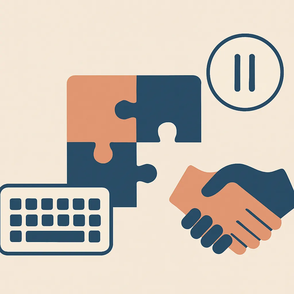
- Keyboard-first input: Remap keys or use keyboard navigation if mouse control is difficult; many browser games respond to keyboard input already.
- Reduce motion: Turn on “reduce motion” in your system preferences or use a site’s reduced-motion option to avoid animations that cause discomfort.
- Use assistive tools: Try a screen reader, text-to-speech, or a color-blindness simulator to see what helps your experience. See a curated list of tools that improve accessibility.
- Short sessions and save points: Break play into 10–20 minute blocks and keep a short note of where you stopped (a timestamp or a few keywords) so you can resume calmly.
Designer checklist: practical items to include
-
Visual clarity and contrast
- Provide high-contrast themes and clear typography (large, legible fonts; adjustable sizes).
- Avoid color alone to convey information — use shapes, patterns, or labels as well.
- Test with color-blindness simulators and simple black-and-white rendering.
-
Input flexibility
- Support multiple input modes: mouse/touch, keyboard, and where practical, switch or voice input.
- Make all interactive elements focusable and reachable by keyboard; provide clear focus outlines.
- Allow remapping of controls or offer alternative simplified controls for menus and common actions.
-
Timing and pacing
- Design for adjustable or optional timers. Never force a strict countdown without an opt-out.
- Offer pause and resume at any point; show a clear save/resume UI for longer puzzles.
- Give undo and gentle error-tolerant mechanics instead of immediate elimination.
-
Cognitive load and clarity
- Present one core rule at a time and provide an optional quick-reference panel.
- Include progressive hints that go from minimal nudges to more explicit guidance.
- Break complex puzzles into labeled sub-tasks or stages to reduce working memory demands.
-
Motion, animation, and sensory sensitivity
- Limit flashing or rapid motion; provide a “reduced motion” option that turns off nonessential animation.
- Control sound: allow volume control for feedback and an option to mute all nonessential audio.
-
Layout, spacing, and readability
- Keep interfaces uncluttered: clear margins, consistent alignment, and large hit targets for touch.
- Use readable language, short sentences, and accessible copy for instructions and feedback.
-
Social and cooperative play
- Provide clear turn indicators and gentle turn timers; allow asynchronous play so players can participate at different paces.
- Include privacy options and tools for players who prefer solo modes or private groups.
- Design cooperative modes that minimize pressure: shared progress, optional help requests, and no public leaderboards by default.
Testing and documentation
Make accessibility checks part of your test routine. Have short QA tasks that validate contrast, keyboard navigation, screen-reader labels, and reduced-motion toggles. Document the available accessibility options in plain language and link readers to ways they can request adjustments or report issues.
Accessibility-friendly practices for social puzzles
For group or multiplayer puzzle formats, plan for calm interactions: let players opt out of live chat, offer slow-paced cooperative options, and make turn-taking explicit. If you run events or parties, share a brief accessibility guide with participants and offer small accommodations like extended turn windows or written instructions. For inspiration, see a few curated examples of low-stress multiplayer games that model these choices.
Low-effort templates and formats
Small templates help maintain accessibility without heavy redesign. Examples include a one-page “accessibility settings” modal, a printable 2-column quick-reference for rules, and a short checklist sent with puzzles that reads like an invitation: “Take your time — pause anytime; use the hint button once if stuck.” For journaling progress and accommodations, use a simple format such as date, puzzle name, pause point, and one sentence about difficulty; that compact approach works well across abilities and pairs neatly with easy journaling formats.
Final notes
This puzzle accessibility checklist is meant to be pragmatic: pick a few high-impact changes (text size, contrast, optional timers, and keyboard support) and treat accessibility as ongoing refinement rather than a one-time task. Designers who bake these options in early will reduce friction for players, and players who apply the quick fixes will find many games more comfortable and calming. If you want a short list of assistive tools and extensions to try, see our tools round-up at tools that improve accessibility.